1,000+ Users in the U.S.

Discover
The Project Overview
Initially we ran an immersion session with the client to better understand them and what goals they wanted to achieve from the product, running various how might we's, north star statements and measures of success to hone in what this app could deliver for users.

Discover
The Challenges
1
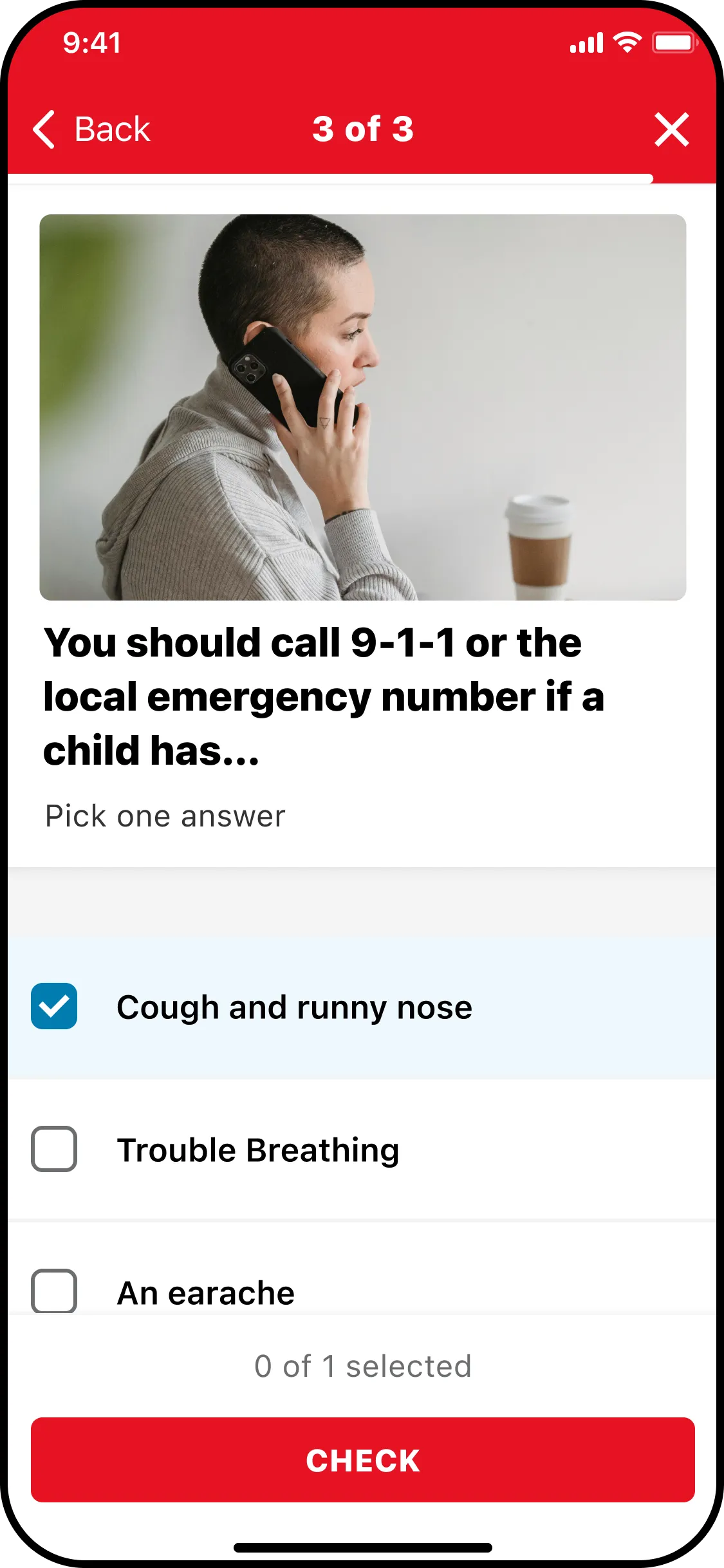
Lacking Emergency Content
The previous training features didn't fully address emergency situations.
2
Retention, Retention, Retention
Existing classroom learning didn’t support proper skill retention
3
Babysitters were struggling to get their businesses off the ground
Discover
My Role
Adapting concepts and turning them into interface designs
Working closely with developers before and after handover to address feasibility and manage scope
Pushing for accessibility for users throughout the design and build phases.
Heading up regular design build reviews to ensure the build didn't drift from the signed off designs, and accessibility / usability was consistently being addressed
Discover
Lightning Demos
After compiling an initial understanding of what the app could offer for users, I explored how some of these features are being implemented successfully in the wider market, lightning demos proved extremely useful to represent these ideas as well as present a case to the client and team.

Discover
Crazy 8's & Solution sketching
Once I had these ideas in place, and some real world examples to take inspiration from, I wanted to explore how these could be applied to Childcare and how I could make them unique to the product.
This was an extremely insightful and exciting session that helped lay the foundations for designing a really awesome project.

Define
The Solution
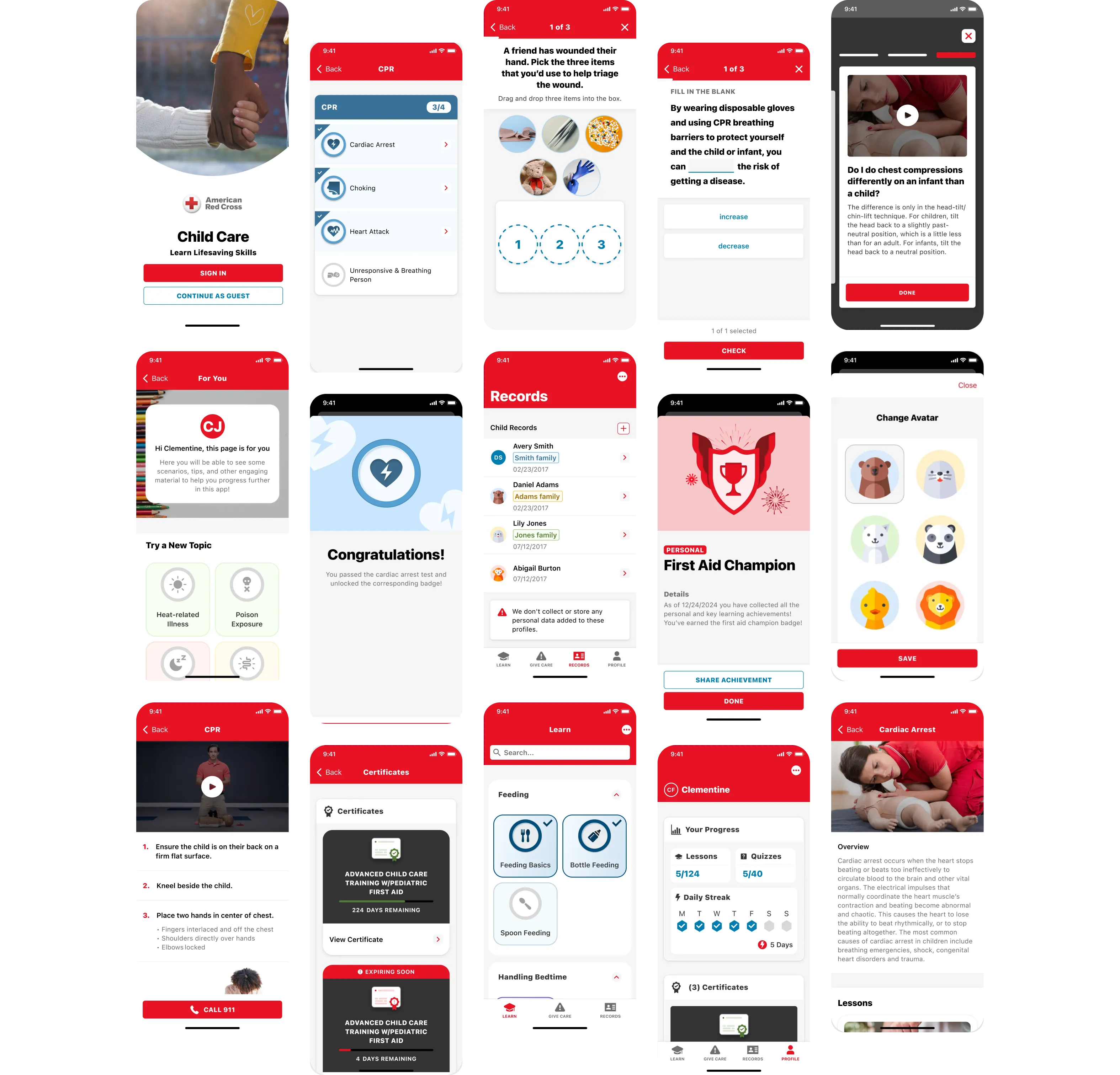
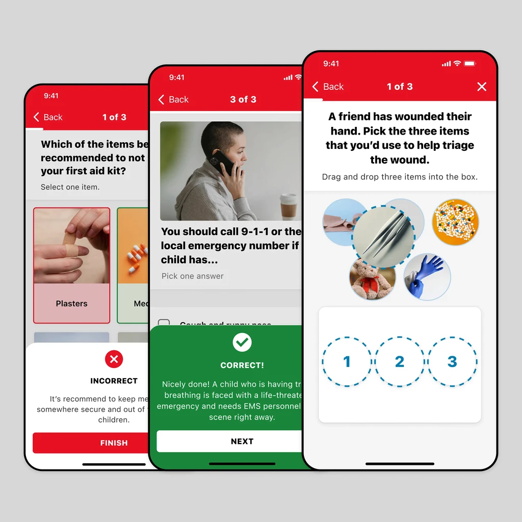
Create an innovative and engaging app tailored to caregivers, combining lifesaving functionality with ease and playfulness.
Design
The Foundations
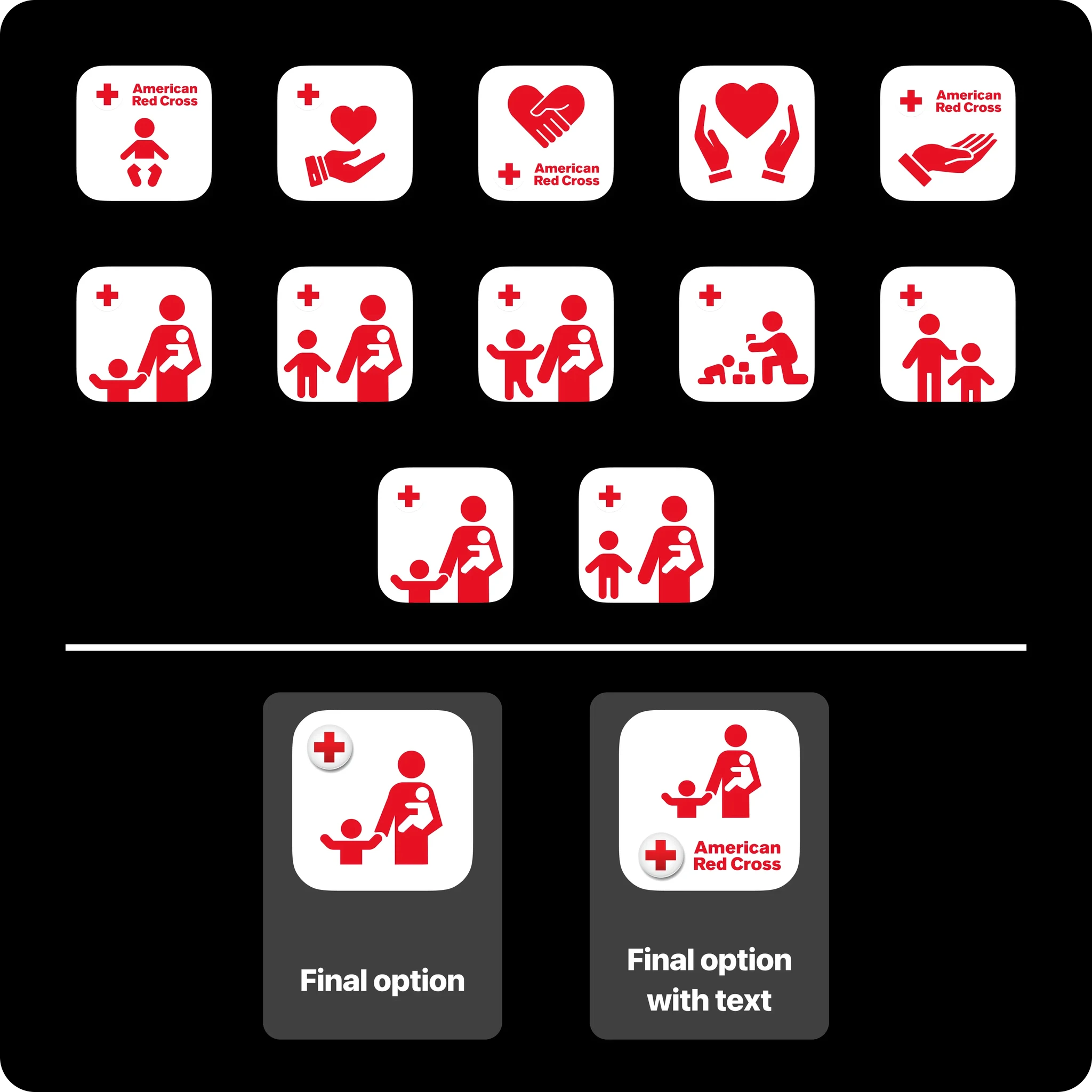
Due to the American Red Cross having such a strong and recognisable branding, colour and iconography had to be at the forefront of anything I designed.
It needed to be consistent across the other suite of apps, therefore these foundations allowed me to instead focus on letting the content of the app be the USP from a creative side.
Design
Something With Colour
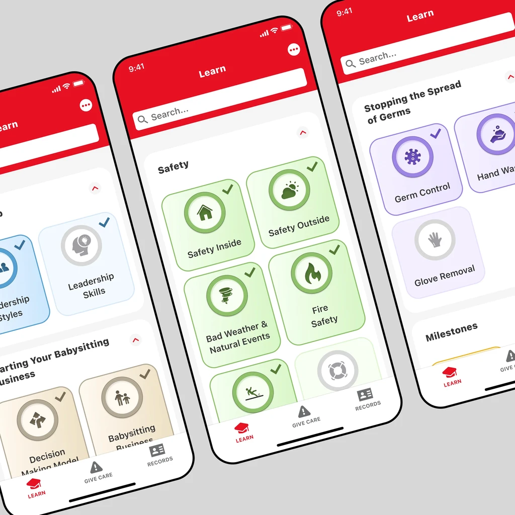
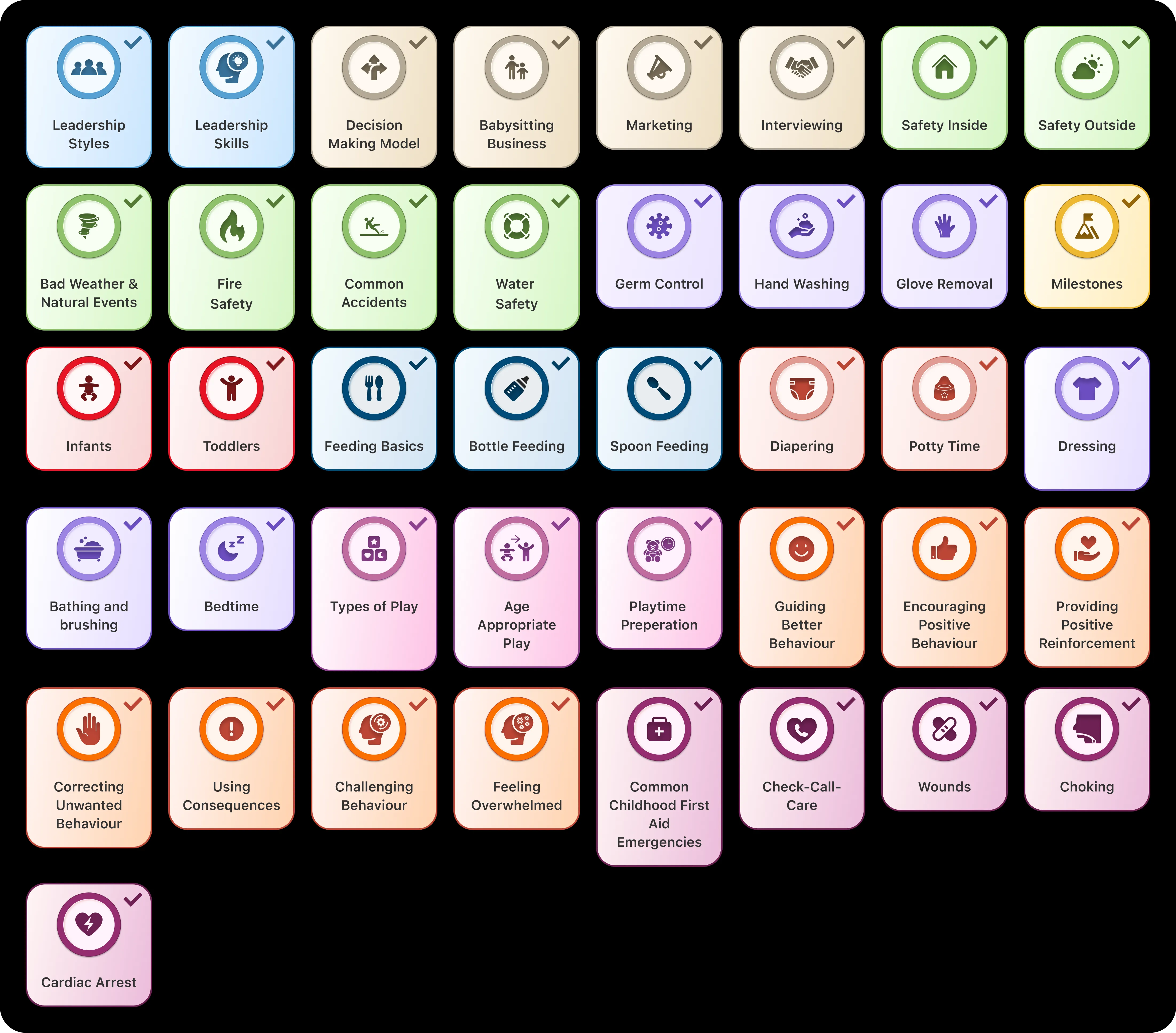
As mentioned above, the use of colour and iconography throughout the app was a must, traditional American Red Cross apps lean heavily on their iconic red, but I wanted to break that up a little.
Dividing topics by colour allowed them to pop and intrigue users wanting to learn more, rather than having a uniform style that might hinder the unique and fun elements of this app.
The final product was an exciting and inviting variation of colour that still has that American Red Cross strikingness and accessibility.
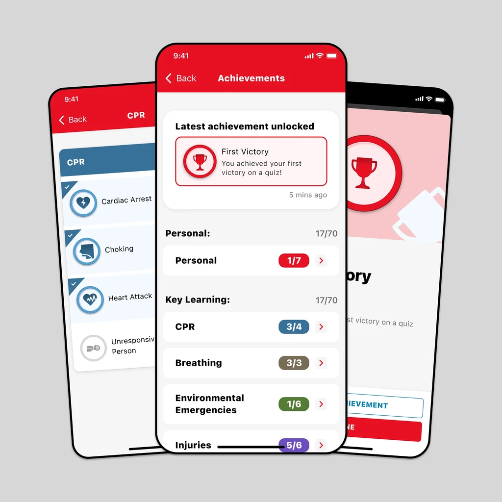
I wanted to incentivise users to complete topics and use the app as much as possible, and what better way to do that then with achievements and streaks?
I split all the achievements into "topics" and "personal" sets, this way users would be rewarded for completing topics, but also for using the app X amount of days, or completing all the topics.
Simple tactics to encourage repeat usage, and rewarding this usage tested extremely well.